Succeeding on social media is hard.
There are millions of accounts sharing billions of tweets, posts, and messages each day. Sometimes cutting through all of that noise seems insurmountable.
There are a ton of factors that go into a successful social media account. But there is one thing that successful brands have: a clear social media strategy.
Not sure where to start? In this article, I’m going to show you how to create your own social media strategy.
All you need is the desire, a social media graphics maker or social media templates, and creativity.
So let’s get started!
Click to jump ahead:
- How to create a social media plan
- Tips and best practices for developing a social media plan
- Example of a social media plan
- Conclusion
How to create a social media plan
Developing a strategic social media plan requires following a series of steps to ensure your online presence aligns engages your target audience and effectively achieves your marketing objectives. Identifying social media marketing niches relevant to your business is a key part of this process. By focusing on specific niches, you can tailor your content to resonate with a particular audience, driving deeper engagement and building a loyal community around your brand.
Step One: Evaluate your current social strategies and tactics
Before you start creating your new social media plan, take a look at what is working now. Or even what has been beneficial for your company in the past.
Sometimes people get too excited and jump into the planning process without taking the time to reflect. However, these insights will be very beneficial and will stop your brand from making the same mistakes.
It may sound a bit overwhelming to audit your social media graphics, posts, and engagement because there’s SO much content. So many people just skip it. And then they’re confused months later when their social media strategies fail.
But if you ask yourself these ten simple questions, you will get a ton of interesting information:
- What is working?
- Who is your ideal customer?
- Where do they hang out or converse?
- What is your most valuable channel?
- Where should you focus your efforts on?
- Where are there opportunities for growth?
- What platforms are not working?
- How much effort are you wasting?
- What are your competitors doing?
Any company or organization should be able to answer these questions. And, trust me, those answers will build a strong foundation that your new social media plan is built on.
Knowing what your brand is and how you’ll align your messaging accordingly is one of the most powerful aspects of social media marketing.
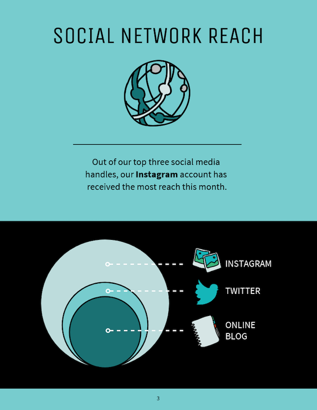
Systematically looking at your social media accounts will also help you figure out where the best opportunities are. Like in this social media plan:
This brand noticed that their current Instagram account is valuable and gets the most reach. So why would they invest time in the other ones? Instead, they’ll take a closer at Instagram trends, the users, and the overall platform to better understand why it works for them.
Also, when you answer these questions, be sure to back them up with data. Don’t make gut calls or use vanity metrics to justify your findings. Be sure to analyze your copy, as well as the content you share on social media.
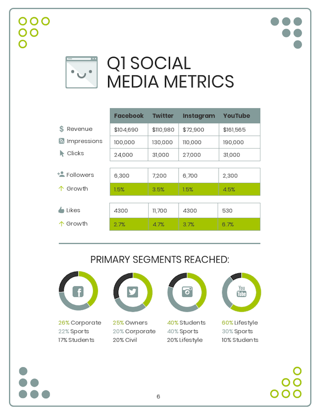
For example, in this social media audit, the creators found that YouTube has the highest growth potential. And that Facebook is just wasting their money:
These insights will help you set achievable and realistic goals in your social media plan.
A lot of writers may recommend setting goals before looking at past performance. But I think this leads to assumptions without having the whole story.
Assumptions are never helpful and usually end up hurting your company. Whereas the more info you have, the better decisions you can make.
Step Two: Set some metric baselines and achievable goals for your social media plan
After you have taken a look at past performance, it’s time to set some baselines and goals for the future.
But first, you will notice I used the word “achievable” to describe the goals in this section title. I included that because you really need to keep the goals you set based in reality.
Setting baselines is a perfect first step to crafting an achievable goal. Now, if you aren’t familiar with the concept, baselines are where your metrics are currently at.
For example, any of the following metrics in this social media plan could be used as a baseline for Q2 goals:
A baseline could be total followers, daily mentions, weekly engagement, or really any metric that your company cares about. Researching these baselines before setting any goals is essential. Then you can design ideal experiments to achieve those goals.
At Venngage, we set baselines before we start any new project as well. We don’t just make up a random growth metric and try to hit that. Instead, we use past performance as a way to guide our future growth.
Now, let’s use the following social media plan as an example of translating baselines into actual goals:
You can see that on Instagram this fictional company gets an average of 147 new followers, 567 mentions, 720 likes per week and so on. These are their baseline metrics for that social network.
Then, they state that growing their Instagram account is the easiest and that their ideal customer is already on Instagram:
We can now take the information found out in step one and combine it with the baselines in this step to build an achievable goal. I came up with this simple example:
- “Over the next 30 days, we are going to increase our new weekly follower count by 30%. By the end of the period, we should be averaging 200 new followers per week.”
This is an example of a goal that is reality-based and can be finished in a measurable timeline.
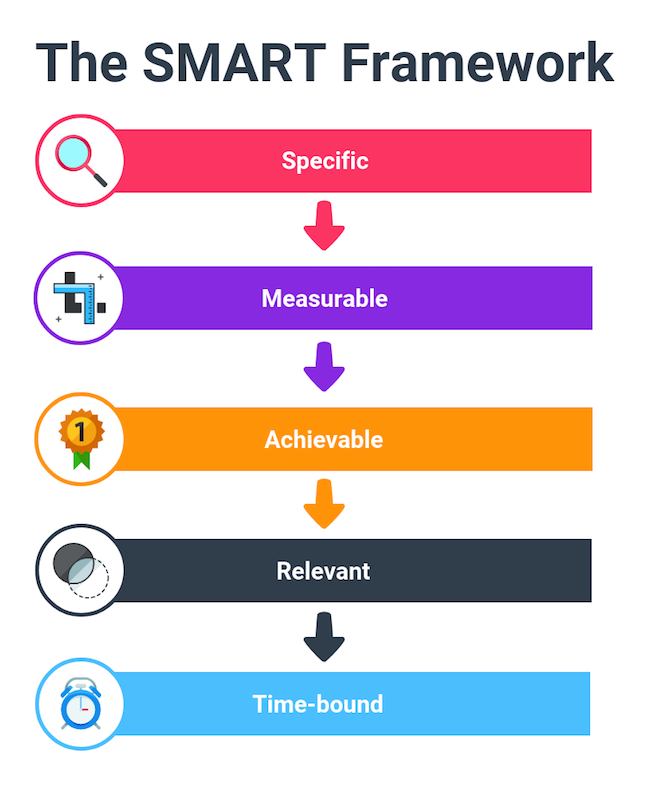
If you’re having trouble setting some goals based on your baselines, I would take a look at the S.M.A.R.T. framework:
As you can see, this infographic says that goals should be: Specific, Measurable, Achievable, Relevant and Time-bound.
If we go back to our example above it checks every box:
- Specific: This goal is specific to Instagram and the increasing follower count.
- Measurable: The follower count and growth percentage are measurable.
- Achievable: It’s definitely achievable, 30% growth isn’t that hard with 66k followers.
- Relevant: Their ideal customer is on Instagram and their strongest platform. And it lines up with their company goals.
- Time-bound: It’s a goal that can be achieved in 30 days and is tracked weekly.
I would recommend using those guidelines to craft 2-3 more social media goals.
Step Three: Break goals down into prioritized inputs and trackable metrics, then assign them to your team
Now that you have set some achievable goals, you need to break them down into smaller inputs.
These inputs can be tasks, to-dos or experiments that you can run to hit those goals. It doesn’t matter what you call it, they just need to be actionable, relevant and trackable. Otherwise, you are going to be throwing random ideas at the problem and have nothing to show for it.
In fact, having a well-defined process is the backbone of any good social media plan or marketing plan as well.
Social media benchmarks can be incredibly useful here, helping you set realistic targets and measure your progress against industry standards.
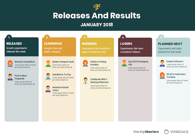
Here at Venngage, we try to stick to a weekly sprint schedule which you can see an abbreviated version of below:
For each of these weekly sprints, we tackle tasks and experiments that have extremely specific terms and scope.
If you take a look at each of the headers, you will see that they are specific, relevant and trackable. Plus, each input has a project owner to ensure the task or experiment is completed on time.
By using this process, we are continually evaluating and reviewing how each helps us work towards the main goals. This shows that we are forward thinking and goal orientated with each small action we take.
Let’s go ahead and use the above outline to come up with a few tasks that directly impact our goal from earlier, like so:
- Research our competitors in the running industry on social media.
- Outline a posting schedule that coincides with big running events.
- Brainstorm how we can use our brand colors and logo more.
- Reach out to 10 running influencers and ask to collaborate.
And here are a few experiments that you could run to help increase follower count:
- Implement our new brand colors on 50% of posts and see if that impacts brand awareness.
- Post 2x more frequently than we have been and track follower increases.
- Buy $20 of Instagram ads to reach more running enthusiasts and increase total followers.
- Collaborate with 2 running influencers on Instagram and promote it on our other social channels.
Now if you want to implement this process, start with this template.
But before you jump into these experiments and tasks with the furor of a young buck, take a look at this graphic:
After validating all of your tasks and experiments, you should assign them to your team members. If we take look at this sprint graphic for our fictional social media plan, you will see that each experiment has a project owner:
This is a very common social media growth tactic that helps ensure things get done, or someone is held accountable.
In fact, we use this process at Venngage to help spread accountability around to the whole team.
You should definitely use this approach in your social media plan as well!
If you really want to learn more about setting high-level growth goals, check this article out.
Step Four: Create a posting or goal calendar in your social media plan to hit those metrics
Once you have all your tasks and experiments outlined, it’s time to schedule them in your social media plan. Take the best times to post on social media into consideration, this will probably require some research into when your audience is active.
At the same time, consider the specifics of every social media. For example, the best time to post on TikTok differs from the most recommended time frames for LinkedIn on YouTube.
If you remember correctly from a previous section, a S.M.A.R.T. goal is time bound.
This schedule can be very vague and only include high-level goals, or get very specific and tackle individual social media posts.
In this social media plan, they actually do both. On one page they outline their monthly high-level goals:
And then follow those up with a more detailed plan on the next page:
I like this approach because it helps the team keep their eye on both big goals and smaller inputs. If you only focus on one or the other it’s very easy to get lost in the weeds. Once you have your promotion workflow, it may be worth looking for some social media management agencies (or even tools) to help you out.
If you’re a fan of the weekly sprints, you can also use this social media plan template:
Or something simple like this marketing plan:
It’s really up to what your business wants to achieve and how much they want to plan in advance.
For example, a shorter social media schedule or schedule facebook group posts could look like this. look like this:
In a case like this where the goal has such a short time period, I would recommend being very detailed and clear. This will help a lot in the review process, and those findings can make or break your future experiments as well.
Step Five: Visualize the previous steps into an organized social media plan
You made it to the final and easiest step of creating a social media plan. In this step, we are going to take all of the information from the previous steps and create a helpful visual with it.
Visualizing your social media plan is beneficial for any company because it helps your whole team understand it. And when you present it to other people, it will be easy to follow.
So let’s get started!
Section one of your social media plan: Current strategy & baselines
Introduce your current strategy and baselines as soon as possible in your social media plan. This approach shows exactly where you want or need to make improvements, which will help solidify your main goals later on.
For example in this social media plan, they explain some of their high-level metrics on the first page.
The focus is on three high-level metrics that matter to their company, with supporting metrics to the left. Those numbers will stick in the reader’s mind and can be referenced later in the plan.
Plus they are presented in a visually appealing way that draws the eye right to them.
The same can be said about this social media plan:
The first section doesn’t have to be dominated by figures and metrics. It also provides a place for you to explain what is and isn’t working in your current plans.
Like in this social media plan template that we referenced earlier:
As you can see, they state that Instagram has been an important part of their current strategy. Then, they explain that Facebook and Twitter are not as valuable in helping them reach their goals.
This brief explanation will help the reader understand why all of their future goals are focused on Instagram.
Section two of your social media plan: High-level goals & metrics
After explaining where you need to make improvements, it’s time to outline how you plan on making those improvements. And quantify exactly how much you want to improve by.
In this section, I recommend outlining your high-level goals, and the metrics you plan to track or improve. Like we saw in the section above, a good goal is S.M.A.R.T.:
If you forget one part of the framework, the goal won’t be very useful or impactful. For example, take a look at the goal in this social media plan:
The primary goal in this brand’s Objective section hits all the main points in the S.M.A.R.T. framework. It’s time-bound, quantifiable and relevant–things a lot of people forget to include.
In this example, they bring attention to the measurable metric they want to improve with a bold font. This design choice will make sure that even people skimming the social media plan will understand your goals.
Additionally, they use well-placed icons to make the metric stand out even more! When people are reading this social media plan they will tend to pay more attention to the content that is presented with icons.
However, writing down your goal is only half of the battle in this section. You also need to highlight which metrics you are going to use to measure success.
In this social media plan template, their key metrics actually get as much attention as the main goals:
This is a great way to really drive home that these are the metrics that your team should actually care about as well.
Especially when the goal is company-wide, and not strictly influenced by your team.
Section three of your social media plan: prioritized inputs, tasks & experiments
Once you have presented the main goals in your social media plan, it’s time to break them down into manageable chunks.
We covered a lot in the planning section above, so let’s jump right into how to present it effectively.
I think that following the S.M.A.R.T. framework in this section will be very beneficial as well. That means each input or experiment should check all of the same boxes that the goals did.
As well as having an owner that ensures the input is completed to the best of their ability.
We can take a look at this social media plan template to see a well-constructed example of that:
As you can see, each of the main inputs or experiments is S.M.A.R.T. And every input has a project leader assigned to it as well.
By using a process infographic, they outline how the experiments interact with each other as well. For complicated experiments, I wholeheartedly recommend visualizing it in a similar way.
Now if you want something a little more informational, this social media plan template may be perfect for you:
In this example, they use symbols or icons to draw your eye to the important information first. And then use relevant icons to help break down the process even more.
This example may present something very similar to the previous plan, but it includes a lot more relevant information. And then they even take it further on the next page:
When both of these pages are viewed together you can quickly see how they are going to attack their main goals. And that should be exactly what this section is all about.
Section four of your social media plan: Content & experiment calendar
After your main inputs are set in stone, it’s important to add them a timeline or calendar!
For this section, I would recommend using a table or a timeline infographic to visualize it effectively. Both of these options are easy to follow, and people know how to read them immediately.
I know that most people are comfortable with making a simple table, so let’s start there. The following social media plan template uses a table to lay out their marketing plan for the next few weeks:
These designers take a straightforward but efficient approach to show how to campaign will shake out. I also like how organized the report design stays very organized because of the table.
That said, I think timeline infographics are perfect for your social media marketing plan.
Timeline infographics are more suited for goals that have a lot of inputs or experiments though.
Each input can be explained in greater detail and show how it ties back to the main goals. And when you present the info in this way, the steps in the whole process can be illustrated clearly.
Section five of your social media plan: Supporting information
For the final section, we are going to look at some of the supporting sections you can add to your social media plan.
These extras are completely optional, but I believe they will add some important info that can help round out your plan.
Probably the most popular addition to a social media plan is the customer or persona guide.
These guides will outline the perfect or target customer in your social media plan. You can see an example of this below:
These can be very basic and only list what social networks you want to target, and which social media marketing tools you want to use. Or very detailed and talk about very specific things like education, gender or salary like in this social media plan:
Next, on the list of supporting sections, we have your mission statement or company goals.
This is something you should refer back to when working on your plan and goals. So you might as well add it to the social media plan:
This will ensure that your team keeps their eyes on the prize throughout the whole social media campaign as well. Because when you are in the weeds every day, it’s easy to forget what you’re working towards.
Tips and best practices for developing a social media plan
Like any business venture, social media requires a well-thought out and well-planned strategy.
To succeed, the following tips and best practices are advised to build a successful social media strategy that actually drives results.
- Define your goals: Clearly outline what you want to achieve with your social media efforts. Are you aiming to increase brand awareness, drive website traffic, generate leads, or enhance customer satisfaction?
- Identify your target audience: Understand who you are trying to reach on social media. Research the demographics, interests, and online behaviors to tailor your content accordingly.
- Choose the right platforms: Select social media platforms that align with your target audience and goals. Consider factors like platform usage, demographics, and content formats.
- Develop a content strategy: Create a plan for your social media content. Determine the type of content you will share (blog posts, images, videos), frequency of posting, and topics you will cover.
- Create engaging content: Develop high-quality content that resonates with your audience. Use visuals, storytelling, and humor to make your content stand out.
- Utilize social media analytics: Track your social media performance using analytics tools. Monitor metrics like engagement, reach, and conversions to measure the effectiveness of your strategy.
- Engage with your audience: Respond to comments, messages, and mentions promptly. Build relationships with your followers by actively participating in conversations.
- Monitor trends and adapt: Stay up-to-date with the latest social media trends and best practices. Be willing to adjust your strategy as needed to remain relevant.
- Collaborate with influencers: Partner with influencers in your industry to reach a wider audience and gain credibility.
- Set a budget and allocate resources: Determine how much you can invest in social media and allocate resources accordingly. Consider factors like content creation, advertising, and social media management tools.
Example of a social media plan
When developing a social media plan, you need to be comprehensive in order to have clarity and ,focus your efforts.
Additionally, a detailed plan outlines key performance indicators (KPIs), making it easier to track your progress and measure the success of your social media campaigns.
Furthermore, a comprehensive plan can be adapted as needed to respond to changes in the market or your target audience. By taking a comprehensive approach, you can increase your chances of achieving your desired outcomes and maximizing your return on investment.
Here’s a great example of a social media plan. It includes the following:
- Cover page: Prominently displays the document’s purpose.
- Table of Contents Organizes the plan into distinct sections for easy navigation.
- Current social presence: This page provides a snapshot of the current state of social media presence across various platforms. It also includes metrics such as follower count, engagement rates, and typical audience demographics.
- Ideal audience: The social media plan provides detailed descriptions about the demographics, interests, and habits.
- Mission statement: Defines what the brand aims to achieve with its social media activities (e.g., increase brand awareness, boost sales, engage with customers).
Conclusion
That’s it! You can obviously expand any of these sections to fit your needs, but each social media plan should include at least the four main section:
- Current Strategy & Baselines
- High-Level Goals & Metrics
- Prioritized Inputs, Tasks & Experiments
- Content & Experiment Calendar
If you have already finished your own social media plan, I would recommend checking out our guides on creating better social media graphics:
- Forget Stock Photos, Use These 8 Social Media Graphic Design Tips Instead
- Social Media Images: The Ultimate Guide to Designing Epic Graphics
Or check out some of our templates for each social network here!


