Creating a memorable poster requires a blend of design principles and creativity. Whether you’re a student, graphic designer, or business owner, this guide will show you creative poster design ideas to inspire impactful designs. Posters are more than just images and text; they are visual statements that leave lasting impressions.
If you want to get a head start and not start from scratch, why not use a poster template to speed up the process? Below, you’ll find poster making ideas and examples that can help you create professional posters with ease.
Here are 55+ creative posters ideas to inspire you, so you can create your own.
9 poster making ideas to keep in mind
Before we start, here are some poster design tips you need to be aware of:
- Use a color overlay for a more understated poster.
- Keep consistent margin widths throughout your design.
- Incorporate your product directly into your creative poster ideas.
- Use directional cues like icons and illustrations to guide the viewer’s eye to important information.
- Design two complementary posters that work together visually.
- Group important information to help it stand out.
- Use accent colors to add interest in minimalist designs.
- Add hand-drawn illustrations to give your poster a personal touch.
- Choose an extra bold color palette for a striking visual effect.
Now onto the complete list:
1. Mix bold complementary colors with a simple layout
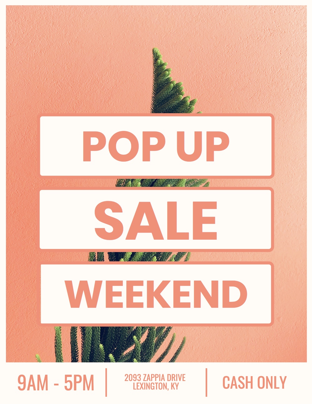
Poster idea: Orange modern marketing poster
This creative poster, with its bold use of complementary colors, looks like it belongs on the wall of your favorite local boutique or coffee house. The poster design uses an orange background to make the off-white sections pop, creating an eye-catching contrast. The succulent in the center adds a trendy touch, introducing a splash of green that complements the overall layout.
Want to try this design for your own poster? Use a simple color palette and let your elements stand out naturally.
Related: How to Apply the Right Layout To Your Poster
2. Use an eye-catching poster background image
Poster idea: Blue pool party creative poster
Your poster background is often the first thing people notice, so make it count! Many designers make the mistake of using generic stock images, but this poster template proves that a well-chosen image can dominate the design and still look modern.
The image naturally divides the poster into sections, guiding the eye smoothly from top to bottom. Paired with bold colors and a contemporary font, this poster creates a visual impact while keeping the message clear.
3. Create motivational posters with color overlays
Poster idea: Simple motivational poster
The best motivational posters are simple and clear. A breathtaking image combined with a bold message often does the trick. However, when your image is too busy or colorful, it can make the text disappear. You can solve this by applying a color overlay to mute the image slightly, as shown in this motivational poster example.
The overlay creates contrast, ensuring that the text stands out and the overall design remains visually appealing. Try this for your next poster making project—it’s a quick way to create professional-looking results.
4. Use leading lines to direct attention
Poster idea: Modern now hiring poster
Leading lines guide the viewer’s eye to the focal point of a design, and they are especially effective in poster layouts. In this example, the lines of the buildings naturally direct the viewer’s eyes down the poster to the job listings at the bottom.
Incorporating leading lines into your poster design can subtly influence how people interact with your content, ensuring that they don’t miss important details.
5. Make your poster pop with a two-toned title
Poster idea: Garage sale event poster
One of the easiest ways to make a poster stand out is by using a two-toned title. Pick two contrasting colors that complement the background to create a striking visual effect. In the example above, the designer uses bold colors that immediately draw attention to the title, making it hard to miss.
Our eyes are naturally drawn to contrasting elements, so using this technique helps your header pop and ensures your message is quickly noticed by passersby.
6. Choose a poster theme that reflects the subject
Poster idea: Science fiction event poster
A common mistake new designers make is choosing a design that doesn’t align with the theme or topic of the poster. For example, a poster promoting a sci-fi event needs to have a futuristic or space-oriented theme to make sense.
In this example, the design reflects Europa, a moon of Jupiter, using dark colors and a minimalistic, futuristic font. A colorful, playful design would have looked out of place. Always match your design choices with the core subject for maximum impact.
7. Use split layouts for “Before and after” effects
Poster idea: Live twice organ donation poster

In marketing, showing a “before” and “after” effect is a powerful way to convey change. This concept can be used in posters too, especially when trying to highlight the impact of a decision or action.
The poster example above splits the page in half to show the difference before and after organ donation, making the message visually impactful and easy to understand. This layout works especially well when you want to show a transformation or highlight benefits.
8. Creatively incorporate product shots into your poster
Poster idea: Nest product poster

Product shots can be tricky to incorporate into posters without them feeling overly promotional. However, in this Nest product poster, the designer seamlessly blends a three-dimensional product image into the flat poster design. It doesn’t feel forced or out of place—it enhances the overall design.
Even if you don’t have a product that fits effortlessly into a poster, consider using it as the background image or as a central focal point. With a little creativity, product shots can elevate the design rather than detract from it.
9. Combine multiple design influences for unique posters
Poster idea: American flag night market poster
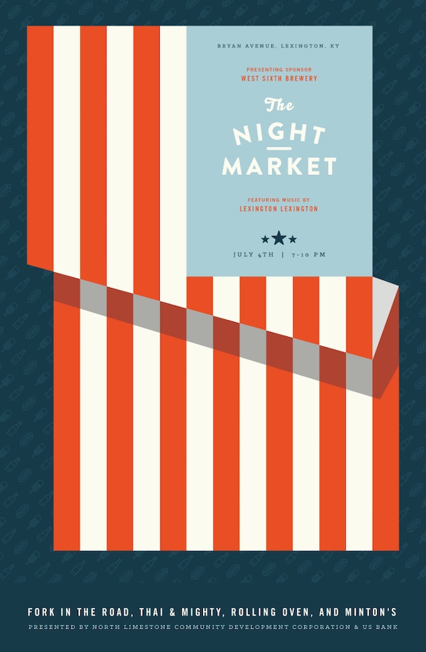
This poster draws inspiration from both the event (a night market) and the date it’s held on (July 4th). The designer masterfully merges these ideas into a cohesive and visually striking poster.
The poster has a vintage feel, with the American flag providing structure that cleverly transitions into an old-school market stall. The combination of design elements captures both the spirit of the event and the holiday, making it a memorable and creative solution.
10. Create multiple versions of your creative poster
Poster idea: Futuristic gradient event poster

Not everyone will be drawn to the same design. People have different tastes, so creating multiple versions of your poster can help you appeal to a broader audience. In the example above, the designer created four different versions of a futuristic event poster, each with its own unique style.
By offering a variety of designs, you increase the chances of resonating with more people, which is especially important for public events or campaigns with diverse target audiences.
11. Always use high-quality images in your poster
Poster idea: Purple yoga poster template
Whether you’re sharing your poster online or printing it, always use high-quality images. Low-resolution or blurry images can make your poster look unprofessional, and viewers may associate poor image quality with your brand.
In this yoga poster, the featured image fits the theme perfectly and looks sharp on any screen or print. High-quality visuals ensure that your poster looks professional, no matter where it’s shared. This attention to detail enhances the perception of your brand and increases engagement.
12. Use icons to create a unique poster design
Poster idea: Retail sale clothing poster
If you want to avoid using photos or images, an icon collage can be a great visual alternative for your poster. Icons allow for greater customization and flexibility—you can choose specific icons that represent your message clearly.
For example, in this retail sale poster, the designer used a collection of clothing icons to visually convey that there are many types of products on sale. This approach is versatile, and you can even customize icon colors to match your brand or theme. The collage also ensures that no single product overshadows the others, making the poster visually balanced.
13. Upgrade a simple poster with bold shapes and patterns
Poster idea: Modern colorful school poster

Raw stock photos can be bland and uninspiring on their own. To avoid this, consider adding bold shapes and patterns to bring life to a simple photo. In this school event poster, the designer transformed an ordinary image by overlaying a striking pattern and using vibrant colors.
This small change makes the poster more dynamic and engaging, proving that a little creativity can elevate a basic design into something memorable.
14. Organize your poster into blocks for clear structure
Poster idea: Typography music festival poster

When your poster has multiple elements, like event information or speaker names, it’s essential to keep the design organized. One effective way to do this is by dividing the layout into blocks or sections, as shown in this music festival poster.
By using clean lines to separate different components, you make it easy for viewers to scan the poster and find the most important details. Without this structure, the information could feel overwhelming or cluttered.
15. Create posters for day-of event signage
Poster idea: Colorful creative school poster
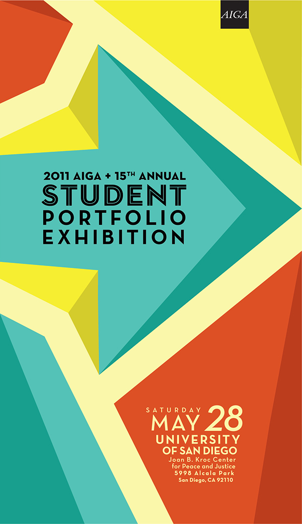
While most posters are designed to promote events weeks or months in advance, don’t forget to create posters for the day of the event itself. These posters can be used for practical purposes, like pointing out directions, listing rules, or sharing the schedule.
The example above features a colorful and clear design that could easily be used to guide attendees during an event. Preparing these types of posters ahead of time ensures a smoother experience for event-goers.
16. Add depth to your poster with transparent shapes
Poster idea: Blue job expo poster
Adding depth to your poster design can make it stand out, and a simple way to achieve this is by using transparent shapes. In this job expo poster, a transparent shape is overlaid on the background, allowing the image to filter through subtly. This gives the poster dimension without overwhelming the design.
The use of transparency keeps the poster light and visually interesting, whereas a solid shape might have made it feel flat and less engaging.
17. Make handwritten fonts the focal point of your poster
Poster idea: Handwritten quote poster

Handwritten fonts continue to trend as brands strive to appear more personal and authentic. These fonts can add a playful and whimsical feel to your poster, making it feel more approachable.
In this example, the handwritten font is paired with a quote that evokes emotion, reinforcing the personal touch of the design. If you used a modern or rigid font, the message wouldn’t have the same impact. Handwritten fonts can be a powerful design element, especially when the goal is to connect with the audience emotionally.
18. Let your background image guide the design
Poster idea: Yellow now hiring poster
Many designers treat the background image as an afterthought, but in this hiring poster example, the background sets the tone for the entire design. From the font colors to the structure of the text, everything flows from the background image.
By letting the background influence your design decisions, you create a more cohesive and visually appealing poster that naturally draws attention.
19. Elevate minimalist posters with accent colors
Poster idea: Colorful minimalist poster
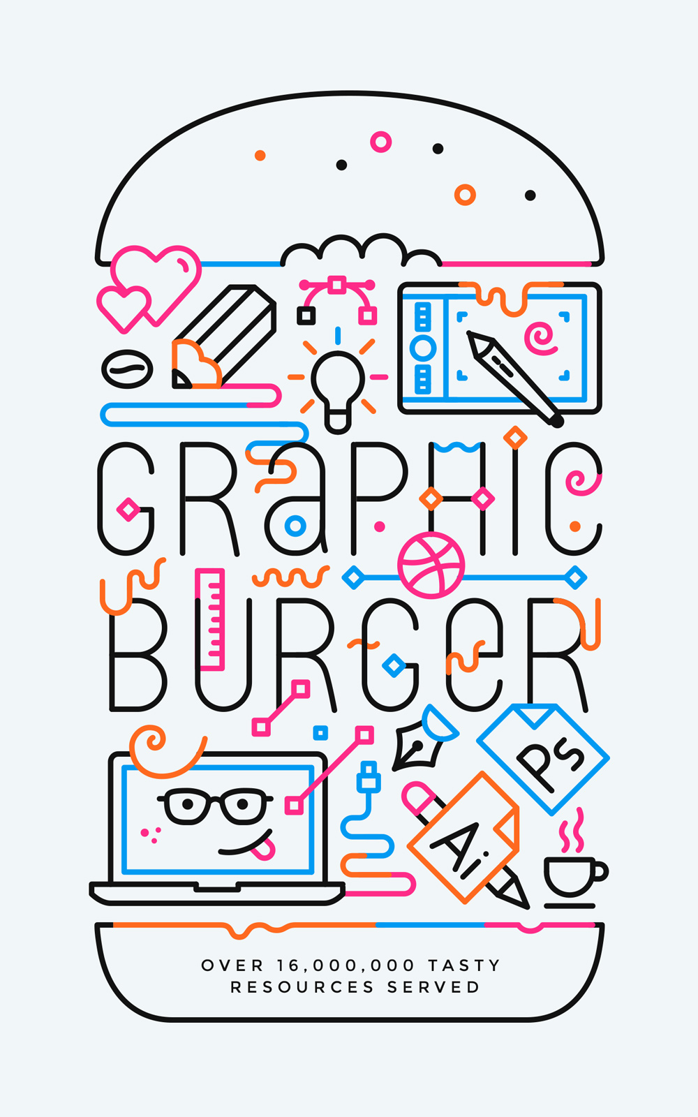
Minimalism doesn’t mean avoiding color. In fact, using accent colors can make minimalist posters more striking. This poster demonstrates how pops of color can elevate a simple design, making it more eye-catching without over-complicating it.
The balance between the clean lines and bold colors gives the design energy while staying true to minimalist principles. If you’re working on a minimalist poster, consider adding a few accent colors to draw attention to key elements.
20. Experiment with landscape orientation for a fresh look
Poster idea: Pink orange horizontal event poster

Most posters are vertically oriented, but using a landscape (horizontal) layout can set your design apart. The event poster example above uses a landscape orientation to great effect, giving the design more breathing room and creating a unique, modern look.
This orientation can work especially well for posters that are meant to be displayed in wide spaces, giving your design a fresh perspective.
21. Focus on a single call-to-action (CTA)
Poster idea: Event poster with website CTA

Every poster should have a clear call-to-action (CTA) to guide the viewer. Whether it’s telling people to visit your event, follow on social media, or check out a website, the CTA needs to be direct and easy to find.
In this example, the CTA encourages viewers to visit a website for more details about the event. By focusing on just one action, the poster avoids confusion and ensures that readers know exactly what to do next.
22. Add unconventional borders for a modern touch
Poster idea: Black white minimalist poster
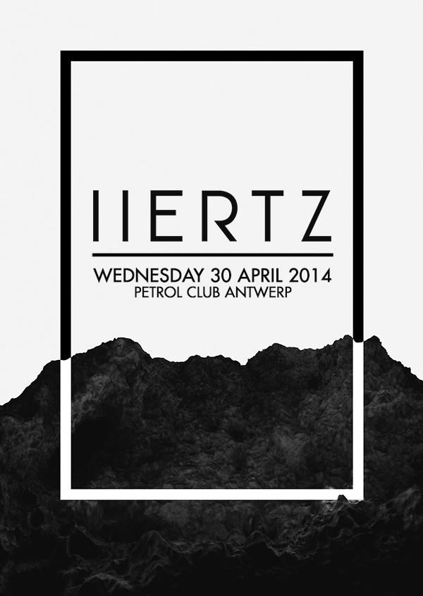
A simple border can add structure to your minimalist posters, making them more visually appealing. In this example, the designer uses a subtle border to frame the content and direct the viewer’s attention to the important details.
The border enhances the overall design by giving the poster a sleek, modern look, while still keeping it functional.
23. Use hand-drawn illustrations for a playful feel
Poster idea: Blue hand-drawn event poster
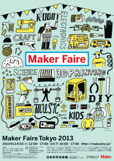
Hand-drawn illustrations can bring a sense of fun and authenticity to your poster design. In this example, the playful illustrations give the event poster a creative and personalized vibe, perfect for a maker’s fair or similar event.
If your brand or event has a casual, creative tone, hand-drawn elements can help convey that feeling, making the design more relatable.
24. Don’t overfill the canvas: use white space effectively
Poster idea: Simple white film festival poster

You don’t need to fill up every inch of your poster. Effective use of white space helps guide the viewer’s attention and keeps the design clean. In this film festival poster, almost half of the canvas is left blank, allowing the featured content to stand out.
White space creates breathing room for your design elements, making the overall poster look more professional and organized. This technique can be particularly useful in minimalist designs or when you want to emphasize a specific focal point.
25. Use a simple background for easy customization
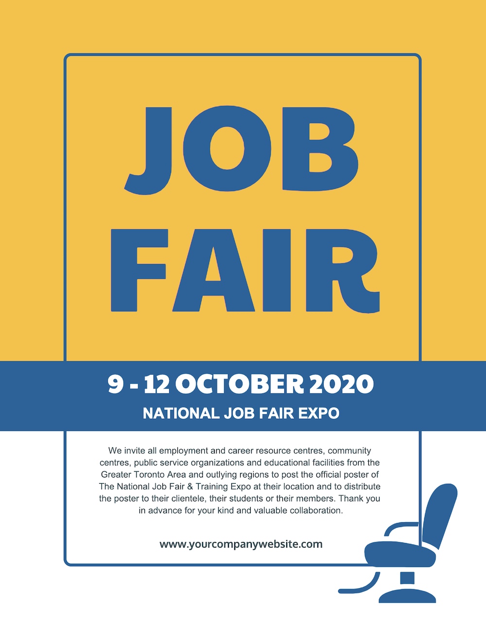
Poster idea: Yellow job fair poster
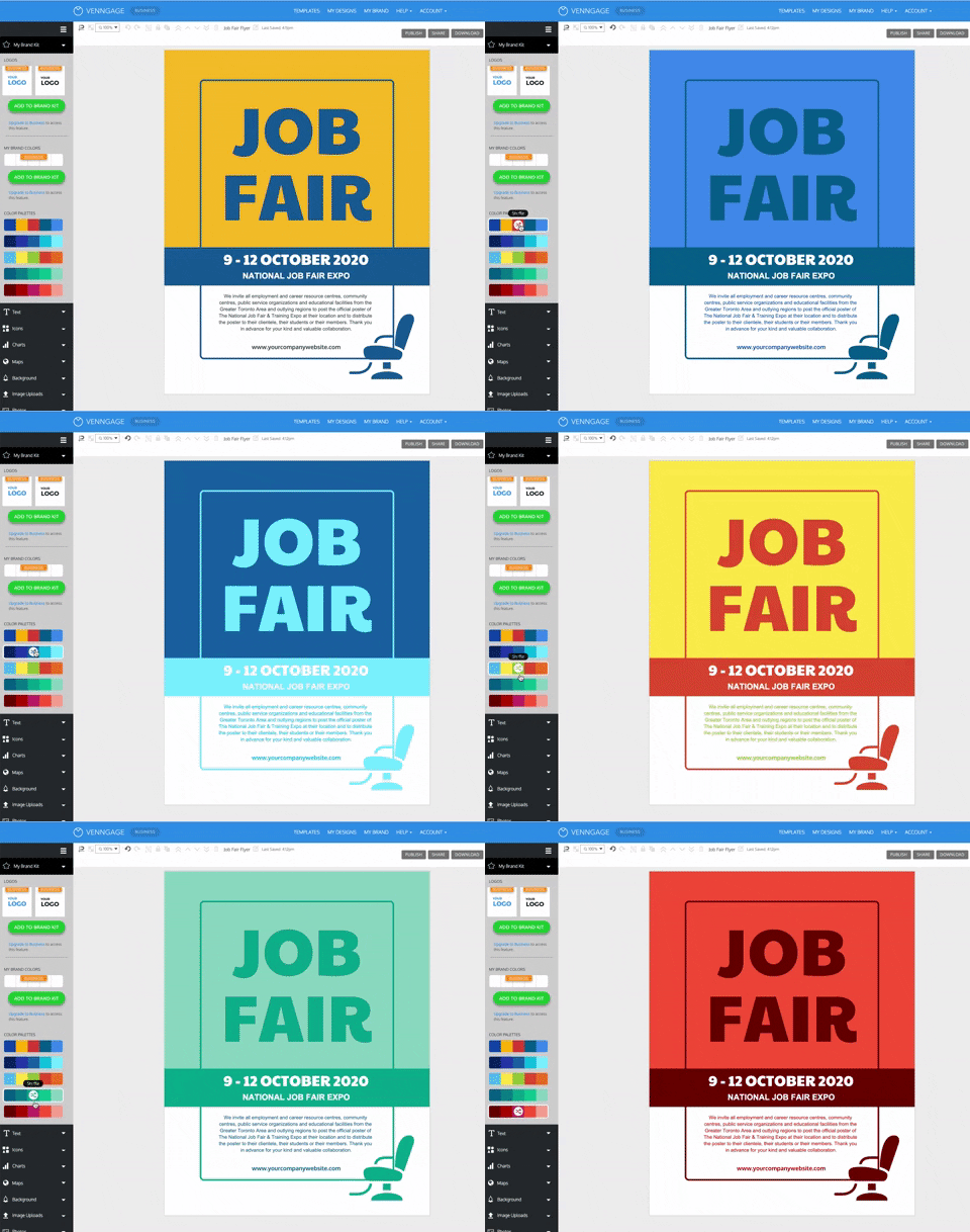
Simplicity can be a strength when designing posters. A flat, simple background, as seen in this job fair poster, ensures the information is the main focus. Additionally, using a simple background allows for easy customization—swap out colors, add branding, or modify the design to suit different events.
This makes it versatile for future use, especially if you’re regularly producing posters for similar events.
Best of all, with a flat background, you can easily change the color scheme of your poster to fit different situations.
You can also easily reuse the poster template for future events this way.
Using Venngage’s My Brand Kit, all you have to do is click once to add your brand colors to the poster.
With a second click, you can see a swap where the colors appear, like so:
26. Enhance poster designs with gradient fills
Poster idea: Gradient event poster


Gradients are an easy way to introduce depth and color variation into your poster designs. In this example, the designer adds gradients to the shapes instead of the background, which brings a dynamic and modern feel to an otherwise simple layout.
By combining gradients with a clean background, the poster gains a sense of dimension, making it more visually interesting without over-complicating the design.
27. Ensure your design matches the event theme
Poster idea: Retro event poster

One of the key rules in poster design is to make sure the style matches the event. A poster for a 90s-themed party should evoke nostalgia, as demonstrated by this retro poster design. The use of vintage colors, fonts, and even a CD icon transports viewers back to that era, perfectly aligning with the event.
When your design matches the event’s mood and theme, it becomes more engaging and memorable for the audience.
28. Organize information using boxes and borders
Poster idea: Sectional business poster
Posters that include a lot of information, like event schedules or speaker lists, need clear organization to remain legible. Using boxes and borders is a simple way to separate different sections of content, as shown in this business poster example.
By dividing the poster into distinct blocks, the design becomes much easier to navigate, ensuring that viewers can quickly find the information they need without feeling overwhelmed.
29. Create custom icon stories for impact
Poster idea: Conservation poster with icon collage
Icons can be used to tell a unique story on your poster. In this conservation poster, pollution-related icons are cleverly arranged to form the shape of a dolphin. This visual storytelling technique engages viewers while reinforcing the poster’s environmental message.
Creating custom icon collages can make your poster more impactful, particularly if the theme involves social causes or abstract concepts.
30. Maintain consistent margins for a professional look
Poster idea: Minimalist motivational poster

Even in busy designs with multiple elements, maintaining consistent margins can make the poster feel professional and organized. In this motivational poster, despite its mix of colors, fonts, and shapes, the consistent margin width keeps the design cohesive.
Margins guide the viewer’s eye, making it easier to move through the content. Whether your poster is minimalist or information-heavy, consistent margins are key to maintaining visual clarity.
31. Use icons as directional cues
Poster idea: Yellow music poster

Incorporating directional cues, like arrows or pointing icons, can help guide viewers to important information. This poster uses arrow-shaped icons to direct attention to the event details at the center. These “directional cues” ensure the poster is easy to navigate, leading the reader directly to the core message.
This technique is especially effective when you want to emphasize specific actions or draw attention to key information.
32. Include a visual pun for added impact
Poster idea: Minimalist black movie poster

Posters that evoke an emotional response are more likely to be remembered. One way to do this is through visual puns or humor, as seen in this creative movie poster. The clever use of a visual pun adds an element of surprise, making the poster stand out.
Using humor or light-hearted visuals can be a fun and effective way to engage viewers, especially for entertainment or casual events.
33. Blend your topic into your font choices
Poster idea: Custom font with icons poster

There’s no rule that says you have to stick with premade fonts when designing a creative poster. Sometimes, creating your own font can make your poster stand out even more. With Venngage’s collection of icons, you can build a custom font that aligns perfectly with your topic.
In one example, a designer used musical graphics and icons to create a custom font that visually communicates the theme of a music event. This approach adds a layer of creativity and helps the poster resonate with its intended audience.
34. Use a solid background shape or border to make text pop
Poster idea: Bold title with solid shape
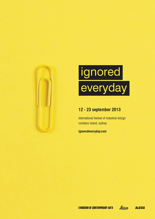
If you want your text to stand out, adding a solid background shape or border can make a huge difference. In this poster, solid black blocks make the title jump off the page, directing the reader’s attention immediately to the key information.
This technique is especially effective for highlighting important details like event dates or websites. Just be careful not to overuse this tactic, as it can lose impact if applied too frequently.
35. Include clever design choices to stand out
Poster idea: Hidden message in design

Sometimes, a clever design is all you need to make your poster stand out. At first glance, this poster may look like a random collection of shoes, but if you step back, you’ll see that the shoes actually spell out a message.
This playful design makes people stop and take a second look, creating intrigue and engagement. Posters that use clever visual tricks are more likely to leave a lasting impression on the viewer.
36. Highlight an object everyone will recognize
Poster idea: Iconic object as a focal point

Posters that reveal deeper meaning over time often have a lasting impact. In this Indiana Jones poster, the grail is instantly recognizable to even casual fans. But when you look closer, you notice that the grail is formed by the profiles of Indiana Jones and his father—a subtle and clever detail.
Using iconic objects that resonate with the audience creates an emotional connection and makes the design more memorable.
37. Include a simple and memorable tagline
Poster idea: Catchy tagline with dual meaning

In a fast-paced world, a simple and effective tagline can make all the difference. This poster shows how a single phrase can convey two messages at once, making the design both unique and modern.
Instead of cluttering the poster with multiple statements, the designer used one concise and memorable tagline, creating a poster that sticks with the viewer.
38. Embrace negative space in your design
Poster idea: Minimalist poster with negative space

You don’t have to fill every inch of your canvas to create an engaging poster. In fact, embracing negative space allows your design to breathe and can make important elements pop.
In this minimalist poster, the blank space around the text draws the viewer’s eye to the focal point, making the message clearer and more impactful.
39. Keep important details in one spot
Poster idea: Organized event information

A creative poster isn’t just about aesthetics—it also needs to convey important information effectively. If event details like date, time, and location aren’t easy to find, the poster fails in its primary function.
In this event poster example, all key details are grouped together, making them easy to spot. The designer used negative space to separate the information from the background, ensuring clarity and readability.
40. Visualize your event schedule with a timeline
Poster idea: Event schedule timeline
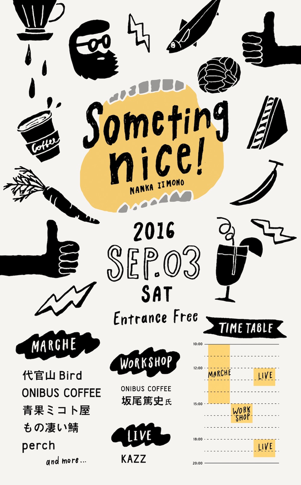
Instead of listing start and end times in a conventional way, this poster uses a timeline to visualize the event schedule. This method makes it easy for viewers to see how events overlap or occur throughout the day.
A timeline layout offers clarity and helps event attendees plan their participation more effectively, especially for events with multiple sessions or activities happening at the same time.
41. Tell a data-driven story with infographic poster
Poster idea: Creative infographic poster

For posters that need to present data or complex information, infographics are an effective design tool. Infographics combine graphs, figures, maps, and charts to convey information visually.
In the example, the infographic effectively explains Credilogic’s growth over a decade. It uses a timeline to showcase the company’s origin, a growth graph for yearly progress, and a visual breakdown of their logo history.
If you’re introducing a company or explaining complex data, using infographic posters is a proven way to engage your audience and tell a story visually.
42. Grab attention with contrasting font colors
Poster idea: Yellow illustrated party poster

To capture attention, simply highlight key words or phrases using a contrasting font color. This technique works especially well for action-driven terms like “Free,” “Act Now,” or “50% Off.”
In this example, the word “Drink” is emphasized with a bold color to make it pop off the poster. The designers smartly ensured the message stands out, knowing that offers for free food and drinks are irresistible.
43. Use icons to tell a visual story
Poster idea: Simple black winter event poster

Your audience processes images faster than text, making icons or graphics a powerful tool for posters. Minimalist icons can quickly convey your message without overwhelming the viewer.
In the example above, simple icons are used to communicate that the event is a winter jazz concert. This visual shorthand makes the message clear while keeping the design sleek. Avoid using complex or obscure icons to ensure your message is easily understood.
44. Enhance photos with bold duotones
Poster idea: Modern documentary poster

Duotones have become a lasting trend in graphic design. This technique allows you to add bold, vibrant colors to any image, making it more visually striking.
If you’re working with a stock photo or want to maintain a cohesive color scheme, applying a duotone effect is an excellent way to make your poster stand out. It’s perfect for creating a memorable and unified look.
45. Shift perspectives to create impact
Poster idea: New york city poster

For a fresh take on common ideas, consider changing the viewer’s perspective. Sometimes, a different viewpoint can transform a familiar image into something striking.
In this example, the iconic New York City skyline is flipped, giving a new spin on a well-known subject. The bold, partially obscured text further adds to the poster’s unique visual appeal, making it an instant classic.
46. Break down complex info using colors and shapes
Poster idea: Geometric event poster
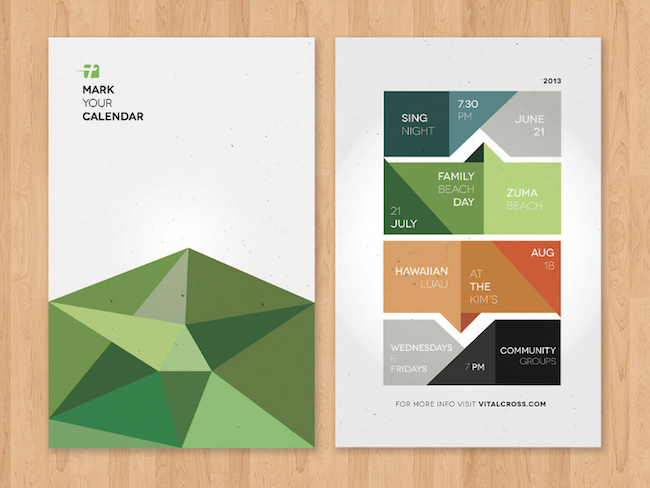
When presenting a lot of information on a poster, it’s crucial to organize content into easily consumable sections. Use colors, shapes, or borders to break down complex data or schedules.
In the example above, the designers used vibrant color blocks and geometric shapes to connect an event schedule, making it visually appealing and easy to follow. This method keeps the design clean while ensuring that readers can quickly grasp the information.
47. Present text in a unique layout
Poster idea: Minimalist typography poster

To make your poster title stand out, think outside the box with text layout. In this minimalist example, the designer breaks the event title across multiple lines, using random word breaks to create a visually interesting focal point.
While this design may take a moment to read, it leaves a lasting impression, ensuring that your message is memorable.
48. Upgrade stock photos with icons, filters, and borders
Poster idea: Pink party poster

Instead of using a plain stock photo, elevate your design by adding flat icons, borders, or color filters. These simple enhancements can turn a generic image into a unique and branded visual.
In the example, a border was added to create structure, while a flat pink shape made the text pop. This minimal adjustment makes the poster engaging and eye-catching, without relying on gimmicks.
49. Elevate minimalist designs with vivid colors
Poster idea: Futuristic gradient Nike tagline poster

Vivid color palettes are a major trend in modern design, embraced by brands like Apple, Spotify, and Google. You can incorporate bold, bright colors into your minimalist poster to create visual interest without sacrificing simplicity.
In the example, the designers used a vivid gradient that draws the eye while maintaining the minimalist design principles, ensuring the poster remains both sleek and impactful.
50. Make your text pop with layers and depths
Poster idea: Red modern Nike product poster

Bold text has become a dominant design trend, especially in digital and social media. To take this trend further, try adding layers and depth to your typography, just like in this Nike poster example.
By separating the bold text into multiple layers, the design gains dimension and grabs attention in a way that stands out both in real life and on-screen. This technique ensures your poster leaves a strong visual impression.
51. Replace letters with icons for a creative twist
Poster idea: Minimalist “Go vote” poster

This minimalist poster offers a clever design by replacing the letter “O” in “Vote” with an icon, making the message more engaging and visually distinct. This small yet impactful design choice highlights the importance of voting in a fun and creative way.
By swapping a single letter for a meaningful icon, the designer ensures the message is memorable and widely shared. Two years after its release, the poster continues to circulate on social media—a testament to the power of creative simplicity.
52. Avoid dull backgrounds for your color filters
Poster idea: Modern minimalist poster

With countless free images, stock photos, and patterns available, there’s no reason to use a boring background beneath your color filter. An interesting background can significantly enhance the appeal of your design.
In this example, the vibrant flower pattern adds richness and depth to the minimalist poster, without overshadowing the text. This design reflects the colorful minimalism trend, where simple yet vivid visuals elevate the overall aesthetic.
And if you’re looking for a little more info about creating posters you should start here:


